Background
One of the most challenging tasks when designing for web is the need to account for various screen sizes and resolutions. It is impossible to design for every possible breakpoint, but our job as designers is to find the best possible solution between complexity and feasibility.
One of the things I was recently interested in was typography. Most of the time, websites only use one or two type scales, one for mobile and one for desktop. This approach worked but a better solution exists.
The Problem
Deciding how many type scales to use is a difficult task. Not only do we need to consider the number of breakpoints, but also find a coherent scale across all of them. As anticipated before using only two type scales is not ideal.
I’ve spent countless hours trying to perfect different type scales but the approach was always by feel. This approach not only takes a lot of time but also leads to inconsistent results. A better solution was needed.
The Idea
There are already many type scale generators out there, but I wanted something that was tailored to my needs. I wanted a tool that would allow me to create different type scales with a mathematical approach. I also wanted to visualize the preview and being able to change in on the fly. Finally I wanted to be able to share the type scale with others.
For this reason, I created not only one tool but two.
Type Scale Calculator
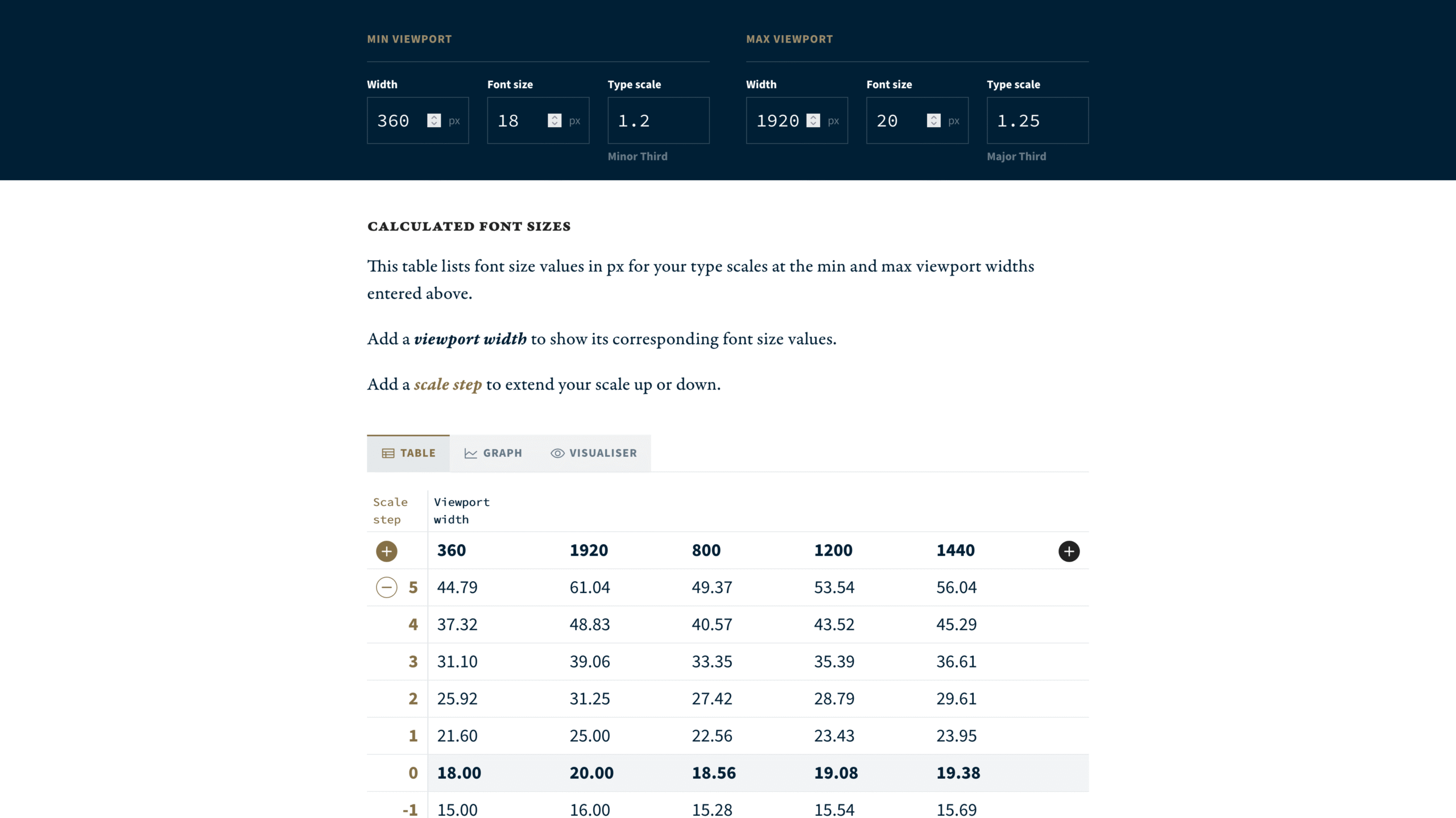
Utopia Type Scale Calculator
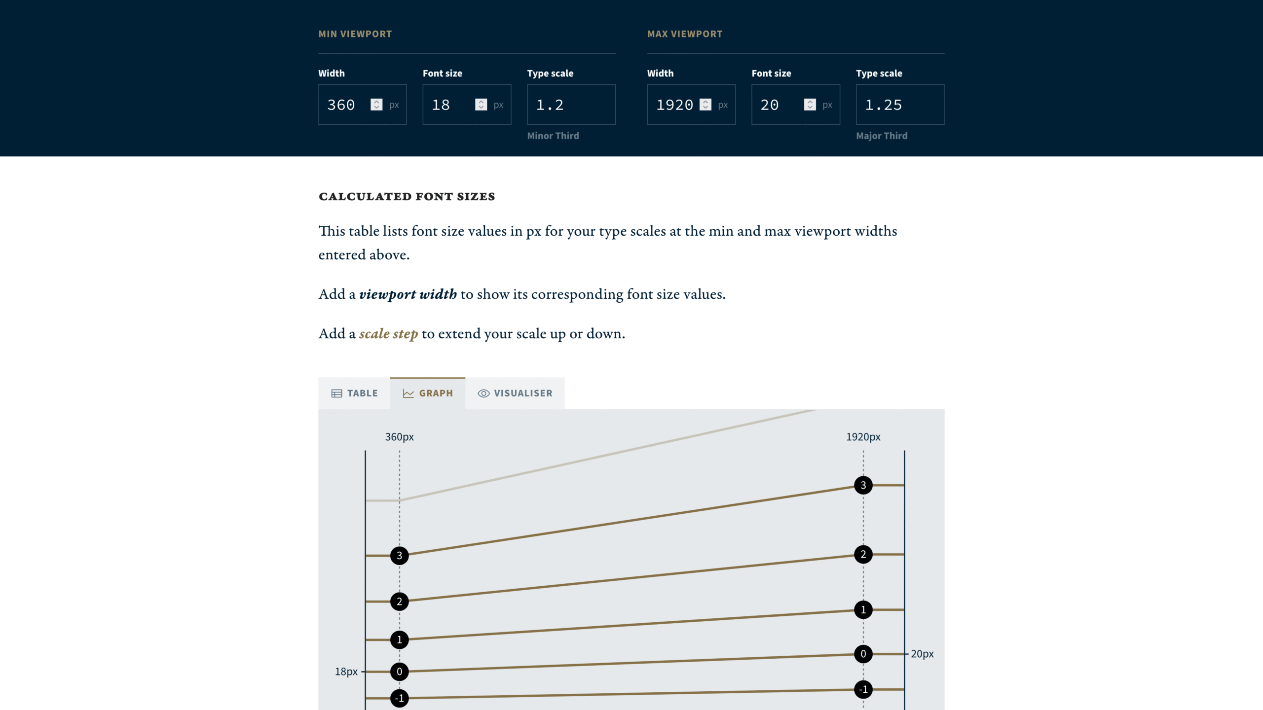
Graph Visualization
The idea for this tool was inspired by the work of https://utopia.fyi/
They created a tool that allows you to create multiple breakpoints and for each breakpoint specify the type scale multiplier that you want.
This tool felt like a good starting point but there were a few things that I wanted to add. First of all, you are not able to rearrange breakpoints, which led to a visual mess. You see the smallest, the biggest and all the other in the middle. Changing them also requires you to open a modal every time.
Secondly, there are no rounding options available. In order to better communicate with designers and developers, this feature was needed. No one want to use a font size of 17,82px.
Also, there was no way to customize the interpolation between the smallest and largest breakpoint. This is not an issue with just two breakpoints, but with more breakpoints it could be a useful feature.
Lastly, their visualization graph was also not very detailed, it felt very generic compared to the type scale generated.
All these reasons led me to create my own tool.
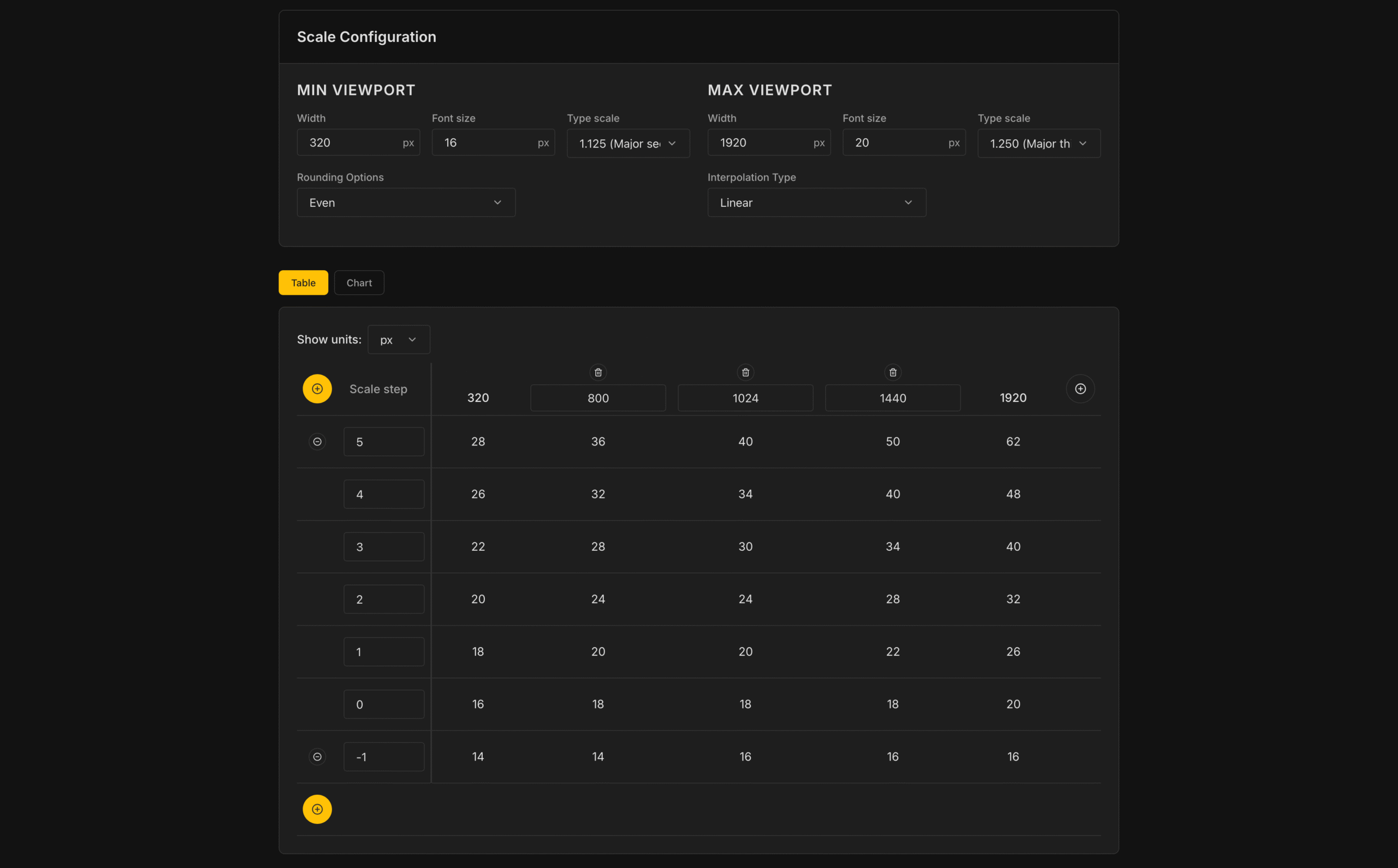
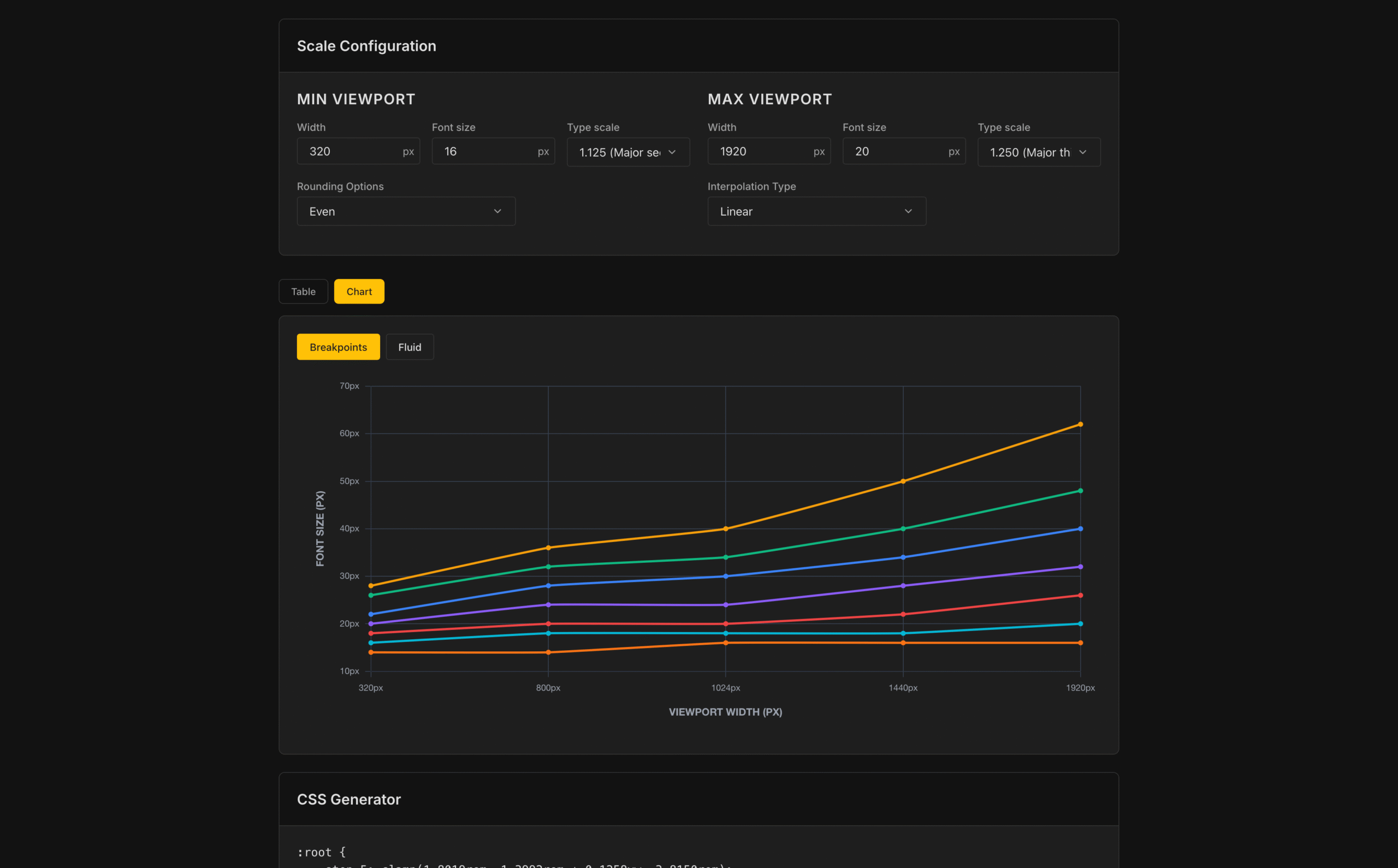
Let’s explore the main features of my tool:
Easy breakpoint management:
You can quickly add or remove breakpoints by simply clicking on the plus icon or remove them by clicking on the trash icon.
Breakpoint rearrangement:
Breakpoints automatically rearrange from the smallest to the largest. If you replace the minimum or the maximum breakpoint the value will reflect in the main configuration.
If you try to add a breakpoint that is already in the list, you will be prompted with a warning message.
px and rem:
You can visualize the value both in px or in rem based on your preference.
Rounding options:
You can round the value to even values, which is usually what designers like. Or you can round the value to the next or previous integer.
Interpolation:
When calculating the values you can use different interpolation options. Linear is the default one but you can choose the one that you like most.
Graph:
The visualization chart shows you how your type scale changes across breakpoints. At the same time you can also switch to a Fluid visualization.
This one shows you how a typescale would react if you used CSS clamps instead of a fixed typescale.
CSS Generator:
Here you can get the output in case you want to use CSS clamps.
URL Sharing:
You can easily share the URL of your type scale with others. Since all the parameters are stored in the URL, you can bookmark it or save it for later use.
Scale Visualizer
The scale visualizer is a companion tool to the scale calculator. It helps designer or developers visualize how a type scale would look like in a real world scenario. Here you can import all the values you generated with the previous tool and even changed them manually to suit your needs.
Let’s explore the main features:
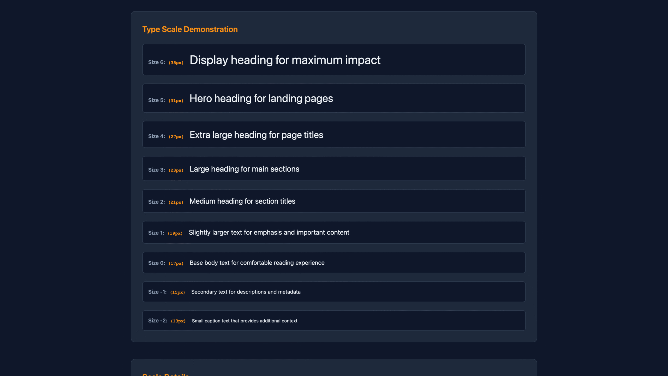
Sizes: you are welcomed with a preview of all the font sizes you generated. The whole page is responsive so as you resize the window the font sizes will change accordingly.
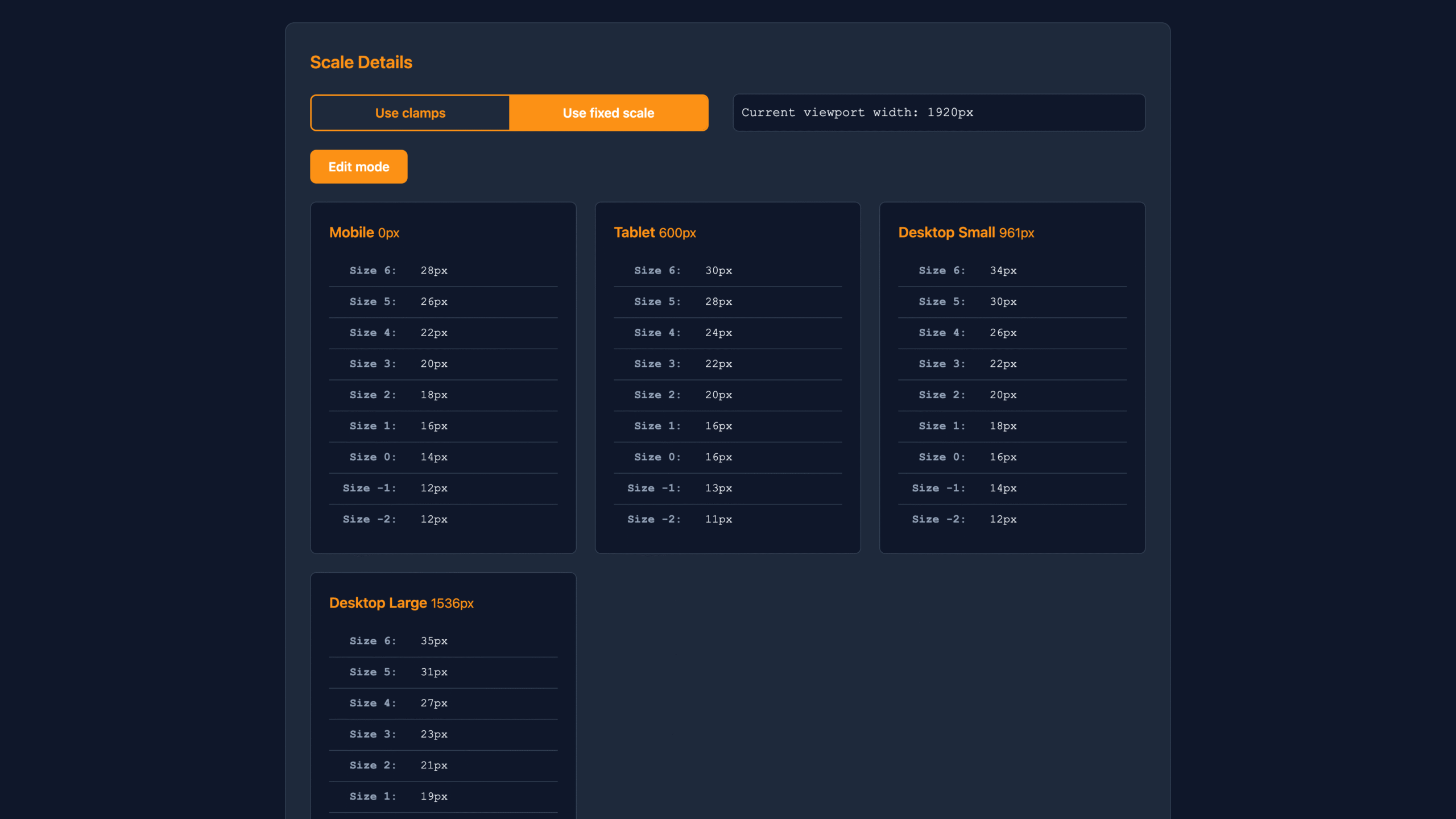
Scale detail: here you will see the scale in detail. You will see all the single font sizes for each breakpoint and you will also be able to change them manually.
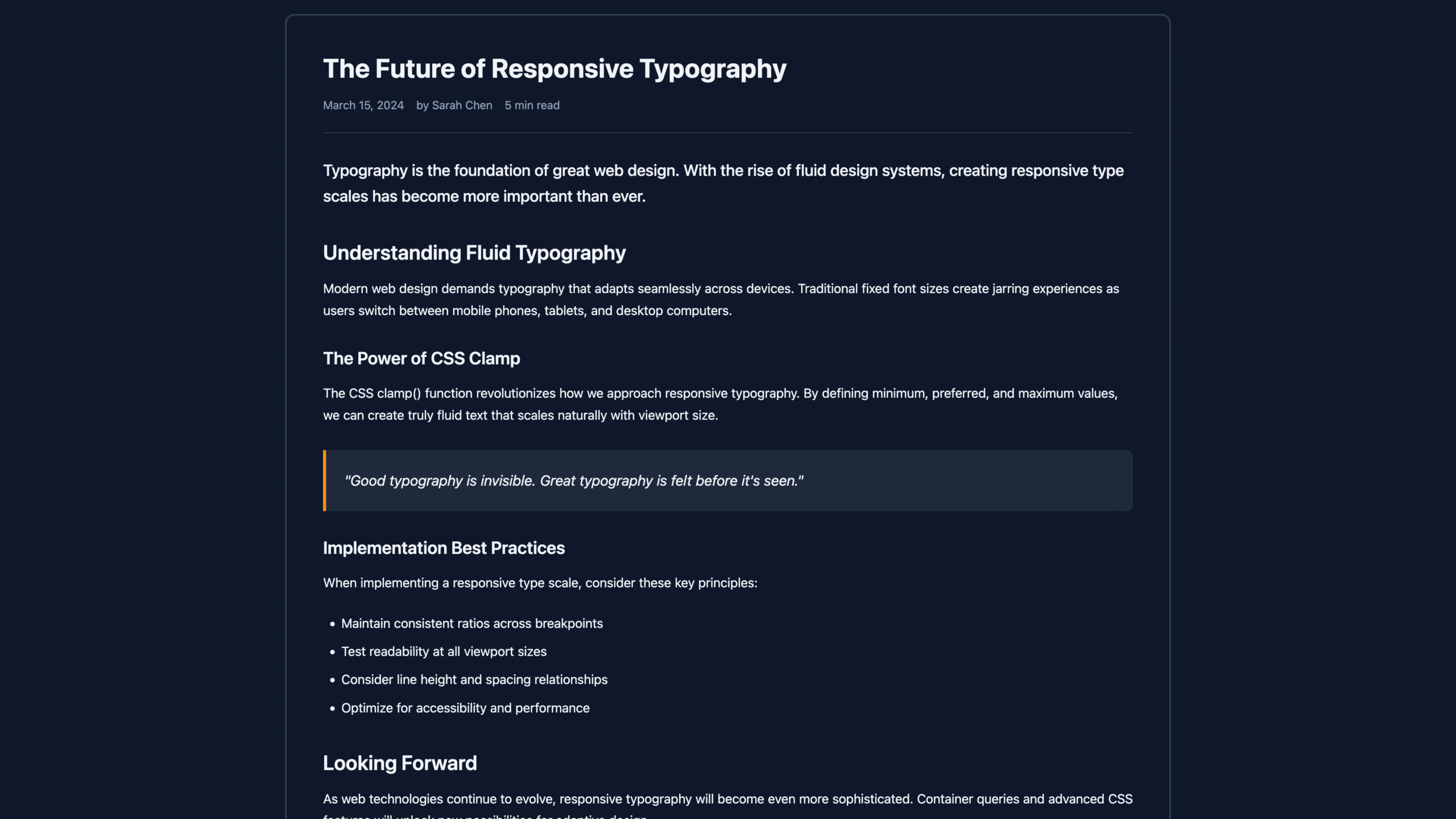
Preview: in this part you will see a blog post preview that would allow you to see how text will look like in a realistic scenario.
Give them a try!
If you want to see them in action or test them by yourself you can use them here. Keep in mind that they are still in beta so you might encounter some bugs.